#css footer design
Explore tagged Tumblr posts
Visit Tumblr Blog
Explore Tumblr blogs with no restrictions, modern design and the best experience.
Last Seen Tumblr Blogs


Fun Fact
Tumblr.com is the 103rd most visited website in the world.
Text

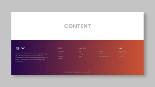
Bootstrap 5 Footer Design
#bootstrap 5 footer design#css footer design#responsive web design#bootstrap snippet#html css#codenewbies#html5 css3#frontenddevelopment#webdesign#footer html css#responsive footer design#css
1 note
·
View note
Text
Responsive Footer Design
#flexbox footer design#responsive web design#frontend#html css#css#html#css3#frontenddevelopment#webdesign#neduzone#website footer#css footer#footer html css
9 notes
·
View notes
Text

footer design
#css footer#html css#footer design#responsive footer#divinector#css#frontenddevelopment#webdesign#html#css3#learn to code#responsive web design
4 notes
·
View notes
Text
Código que usa; header, con menú navegación, cuerpo , con textos y footer con enlaces
Aquí tienes un código HTML que crea una estructura básica de una página web con los elementos que has solicitado, utilizando la etiqueta style para aplicar los estilos CSS directamente en el HTML: HTML <!DOCTYPE html> <html> <head> <title>Mi Página Web</title> <style> header { background-color: #f1f1f1; padding: 20px; text-align: center; } nav ul { list-style-type: none; margin: 0; padding:…
#código fuente#CSS#desarrollo web#Diseño web#estilos en línea#estructura básica de una página web#footer#header#HTML#maquetación web#menú#navegación#página web#responsive design#sitio web#tutorial
0 notes
Text


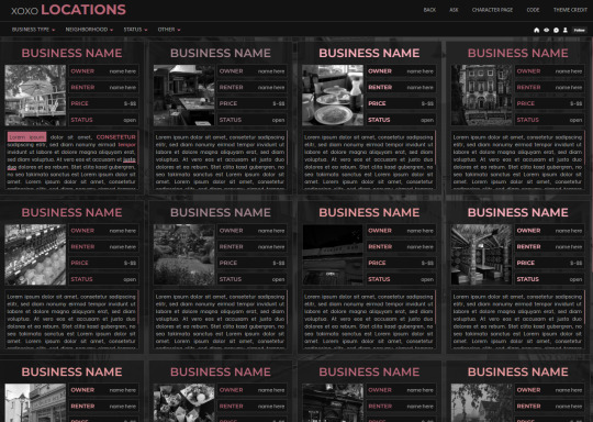
XOXO - RPG THEME SET - 1k SPECIAL !!!
This theme set is completely free. It is a special thank you for 1k followers. Please support me and my work by liking and reblogging this post!
[ BLOG THEME INFORMATION ]
Option between 400px, 450px, 500px and 540px posts.
Custom Body Fonts and Body Font sizes (11px - 13px)
Two Custom Header Links
Two Dropdown Links with unlimited link options
Dropdown Links are optional
Fully supports NPF (beta editor) posts.
The theme adjusts to different screen sizes.
Visible Source Link & Scroll to top button.
A lot of the design can be changed in the editing panel. Everything else is explained in the code.
Sidebar Boxes for: Welcome, Events, Admins, Quick Links and Schedule
Quick RPG Information on the header (Member & Application count, short rp information and Plot description)
Disclaimer and further blog information in the footer.
Sticky Sidebar
Footer can be turned off.
[ LOCATION PAGE ]
The Page does not contain any javascript (100% java free)
Comes in 2 versions (with and without filters)
Location picture sizes are 130 x 130. They will resize automatically.
Option for a background picture.
3 Custom Links
All colors can be easily edited on top of the css code
The theme will resize to different screen sizes.
Custom accent colors (explanation in the code)
[ CHARACTER PAGE ]
The Page does not contain any javascript (100% java free)
Comes in 2 versions (with and without filters)
Character picture sizes are 155 x 150. They will resize automatically.
Option for a background picture.
3 Custom Links
All colors can be easily edited on top of the css code
The theme will resize to different screen sizes.
Character boxes have custom links.
Custom accent colors (explanation in the code)
[ GUIDELINES ]
Do not claim as your own.
Do not remove the credit!
Do not use as a base code or take parts of this code for your theme.
Feel free to edit as much as you want!
All credits are mentioned in the code!
Static Blog Theme Preview + Page Preview Links + All Codes Location Page Preview + All Codes Character Page Preview + All Codes All codes (without preview)
#rpg theme#rp theme#free theme#non contained theme#character page#location page#page theme#rph#rpc#rp resources
843 notes
·
View notes
Note
Hi!! I wanted to say that I loved reading about your journey of creating a personal website. I'm still unsure between Vercel and Netlify. I have a small question to ask. See, one of the reasons I want to make a website is to archive drawings and journal/sketchbook. Would you have any tips for creating an area on my website just for the diary/journal, which has tags, files for each entry, etc.?
Bello!

Really happy to hear about your interest in websites! I want everyone to make their own site so I don't have to log into social media and get instant tummyaches ♥
Vercel vs Netlify: I think I settled on Vercel for absolutely no reason whatsoever. I just made a site on Netlify, then tested on Vercel, and now I have like 5 websites on Vercel so I just kept using it LOL. I'm sure a more tech-savvy person would know the difference - I think they have certain integrations with specific programs.
Creating a diary or journal with tags:
There's a couple of different ways you can do that, with different levels of work needed.
you got me yapping again:
This sadgrl tutorial might be outdated and may or may not work, but explains the process better than I can.
Easiest: make a journal on Dreamwidth, or another blogging site (wordpress??) that allows easy tags and RSS feed, and embed that RSS feed onto your site.
This requires almost no HTML set-up, and the easiest to organize tags, but you don't truly have the data on your own site since it's just embedded.
When I snuck into a web design class at college, this was one of the methods that the professor used for a blog within a portfolio site LOL.
Shit like wordpress is what a LOT of ~professional~ sites do for their blog section. They code it separately from the main site haha. It's the most popular thing, but not necessarily the best. And wait til you read on what the CEO of wordpress has been having meltdowns about... he owns tumblr too!
It's made with a tutorial for Neocities if that's what you use.
Medium: Set up zonelets.
It will require some HTML and JS editing, but will help automate making headers/footers for each page of a blog.
I've never used it myself, but I see other people speak highly of it.
HARD FOR ME CUZ I'M A GORILLA: I believe a lot of professional web devs will slap your face with their coding cock until you use a static site generator (SSG) to make your site.
You will need some coding knowledge to set up the tagging system since it doesn't come with it enabled by default. But it's made explicitly to be an alternative to big Static Site Generators which are...
It requires some more intimidating knowledge, because it's a lot of scripts that turn files that are not HTML/CSS/JS into plain HTML.
Also you have to use the command line, and that doesn't come with buttons that tell you what you can do. You have to copy/paste all that shit or memorize the code to 'dev build astro' and it all looks silly.
I've used Eleventy, and now am using Astro. Other people use Hugo or Jekyll or some other stuff with crazy names like Glup Shitto. I hate all these sites cuz none of the words mean anything to me. This is a common theme for me and tech. I don't know what NODES or CONTENT or ISLANDS are!!!
I had the most success attempting to learn how to use a SSG by downloading a template and altering it with github + VScodium. Here's the template page for Astro. You click on a theme you like, and it takes you to its github page. (If you don't want to use evil Microsoft stuff sorry. Skip this entire section.) Follow the instructions on the page for "forking" the glup shitto. When it tells you to run commands, I run those commands through the terminal window in VScodium. These tutorials never tell you what these commands do cuz they assume you already know. Usually those commands automatically install the files you need onto your computer, and create the final files.
You can see my wip here for a "tag system" that SHOULD show members of a web listing haha but I don't know what I'm doing and I have a reading disorder AND don't know cumputer good.
THEORETICALLY this will be the simplest and easiest way to maintain tags and files, because after you set it up you just have to write the "content" of the blog page. And you don't have to set up the header/footer ever again. I see the vision, and potential, but I am not there yet when it takes me 5 hours a day to figure out what any of the words in the documentation mean and I don't want to ask an actual tech person cuz they will be like 'obviously just press the Blip on the Repository and then Suck My Ass in the command line".
(side note I haven't updated fujofans in like a year cuz I'm struggling with this part to make updating easier).
Con: the final HTML/CSS code is really ugly if it's "minified", and a lot of themes use """"""professional"""""" CSS libraries like Bootstrap and Tailwind that I honestly think are ugly cuz that's what every fuckin' tech website uses to style their pages and make them look Professional and Minimalist with stupid code like style="500-w dark-gray-balls D-cup-bra" on every single element. Even Toyhouse uses Bootstrap. Eugh!
But maybe you're smarter than me and can wrangle these things better!
That was really long. Woops. I hope you can slug through this wall of text and find something helpful. Feel free to email me if you have any more specific questions. I may or may not be helpful.
If someone else sees this and has better suggestions for making BLOGS, please chime in. I'm begging you.
64 notes
·
View notes
Text
Let's understand HTML

Cover these topics to complete your HTML journey.
HTML (HyperText Markup Language) is the standard language used to create web pages. Here's a comprehensive list of key topics in HTML:
1. Basics of HTML
Introduction to HTML
HTML Document Structure
HTML Tags and Elements
HTML Attributes
HTML Comments
HTML Doctype
2. HTML Text Formatting
Headings (<h1> to <h6>)
Paragraphs (<p>)
Line Breaks (<br>)
Horizontal Lines (<hr>)
Bold Text (<b>, <strong>)
Italic Text (<i>, <em>)
Underlined Text (<u>)
Superscript (<sup>) and Subscript (<sub>)
3. HTML Links
Hyperlinks (<a>)
Target Attribute
Creating Email Links
4. HTML Lists
Ordered Lists (<ol>)
Unordered Lists (<ul>)
Description Lists (<dl>)
Nesting Lists
5. HTML Tables
Table (<table>)
Table Rows (<tr>)
Table Data (<td>)
Table Headings (<th>)
Table Caption (<caption>)
Merging Cells (rowspan, colspan)
Table Borders and Styling
6. HTML Forms
Form (<form>)
Input Types (<input>)
Text Fields (<input type="text">)
Password Fields (<input type="password">)
Radio Buttons (<input type="radio">)
Checkboxes (<input type="checkbox">)
Drop-down Lists (<select>)
Textarea (<textarea>)
Buttons (<button>, <input type="submit">)
Labels (<label>)
Form Action and Method Attributes
7. HTML Media
Images (<img>)
Image Maps
Audio (<audio>)
Video (<video>)
Embedding Media (<embed>)
Object Element (<object>)
Iframes (<iframe>)
8. HTML Semantic Elements
Header (<header>)
Footer (<footer>)
Article (<article>)
Section (<section>)
Aside (<aside>)
Nav (<nav>)
Main (<main>)
Figure (<figure>), Figcaption (<figcaption>)
9. HTML5 New Elements
Canvas (<canvas>)
SVG (<svg>)
Data Attributes
Output Element (<output>)
Progress (<progress>)
Meter (<meter>)
Details (<details>)
Summary (<summary>)
10. HTML Graphics
Scalable Vector Graphics (SVG)
Canvas
Inline SVG
Path Element
11. HTML APIs
Geolocation API
Drag and Drop API
Web Storage API (localStorage and sessionStorage)
Web Workers
History API
12. HTML Entities
Character Entities
Symbol Entities
13. HTML Meta Information
Meta Tags (<meta>)
Setting Character Set (<meta charset="UTF-8">)
Responsive Web Design Meta Tag
SEO-related Meta Tags
14. HTML Best Practices
Accessibility (ARIA roles and attributes)
Semantic HTML
SEO (Search Engine Optimization) Basics
Mobile-Friendly HTML
15. HTML Integration with CSS and JavaScript
Linking CSS (<link>, <style>)
Adding JavaScript (<script>)
Inline CSS and JavaScript
External CSS and JavaScript Files
16. Advanced HTML Concepts
HTML Templates (<template>)
Custom Data Attributes (data-*)
HTML Imports (Deprecated in favor of JavaScript modules)
Web Components
These topics cover the breadth of HTML and will give you a strong foundation for web development.
Full course link for free: https://shorturl.at/igVyr
2 notes
·
View notes
Text
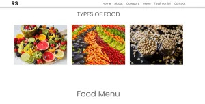
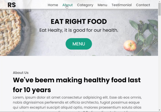
Restaurant Website Using HTML And CSS With Source Code
Restaurant Website Using HTML And CSS With Source Code
Hello coder, Welcome to the Codewithrandom blog. In this article, we create a Restaurant Website using HTML and CSS with Source Code. This is a Simple Restaurant Website with a main home page, types of food available, a food menu, customer reviews, and a contact form section on the restaurant website.
The HTML code for the Restaurant Website is the first thing we develop, and after that, the CSS for styling and JavaScript code. we add JavaScript for smooth scrolling on our website otherwise javascript is optional for this project.
Let’s Start a Responsive and Amazing Restaurant Website Using HTML and CSS. Let’s code a Simple website, We use 1,000+ lines of code to make our Restaurant Website Fully Responsive.
100+ HTML,CSS and JavaScript Projects With Source Code ( Beginners to Advanced)
Basic Knowledge About Project
It’s a front-end intermediate-level project that uses some advanced frameworks like CSS and JavaScript to make the project more elegant and responsive. We have provided you with the project with step-by-step explanations, which will help you better understand the project.
Before we dive into the step-by-step solution to the project, let’s understand some of the basic concepts about restaurant websites using HTML, CSS, and Javascript.
What is an online Restaurant Website?
An online restaurant website is a digital version of any restaurant that allows users to order food directly from the restaurant while sitting at home. These websites were created for customers who wish to eat restaurant food at home. The consumer can select items from the food menu and make payments for faster deliveries.
What are the benefits of Online Restaurant Websites?
reaches the maximum number of customers.
Easy to order
Hassle-free payments
increase in customer reach.
increase in profit.
Live Preview Of Restaurant Website Source Code:-
Restaurant Website Html Code:-
In this HTML code, we create a complete navbar for the footer structure of the restaurant website. first, we link our CSS and JavaScript files in html code. now we add a font awesome icon CDN link in the code because we create the What Our Customers Say section on the website and we show that review with a star so we use a font awesome icon.
Gym Website Using HTML ,CSS and JavaScript (Source Code)
then we create the structure of the navbar and it’s very important in our website because we create a responsive navbar in the project. then we create some simple sections of the restaurant website like what food is available and a food menu list.
and lastly, we create a contact form and a footer copyright line at end of the website.
This is almost 300 lines of HTML code for the restaurant website, and you can see the output below with only the HTML code output of the restaurant menu. Then we add CSS code for styling our restaurant website.
Output Of Only HTML Code For Restaurant Website:-
This is all image output that we create using only HTML code. Now the time is to style our restaurant website using css😍.
Restaurant Website HTML CSS Code:-
In CSS code we include Poppins font from Google font. then we style all sections of the website step by step. we write comments in CSS code so if you want to customize any of the restaurant website parts you can change that section code and it’s all done.
Responsive Resume/CV Website Using HTML & CSS
This is our whole CSS code with 600+ lines. We style our Restaurant Website step by step. We style the utility class and then style our navbar. After the navbar, we styled every html section🔥.
At the end of the code, we use media queries to make our Restaurant Website completely responsive and mobile-friendly. So you can see the output with CSS code. Then we add a little bit of javascript for the scroll effect otherwise our website is completely ready with code.
Ecommerce Website Using HTML, CSS, and JavaScript (Source Code)
Output Of HTML CSS Code Restaurant Website:-
You can see this awesome👏 output with HTML + CSS Code for Restaurant Website. Now we add JavaScript for smooth scrolling.
this is completely optional to add JavaScrpt to this project.
That’s it for our Whole restaurant website code. We write every useful code like making the website mobile-friendly and adding media queries for this. Add JQuery code for smooth scrolling on the restaurant website.
50+ HTML, CSS & JavaScript Projects With Source Code
[su_button id=”download” url=”https://drive.google.com/drive/folders/1Wx9W99uIH3WiO1nkz6aJYCuXVv_ibGmA?usp=sharing” target=”blank” style=”3d” size=”11″ wide=”yes” center=”yes” icon=”icon: download”]DOWNLOAD NOW[/su_button]
Final Output For Restaurant Website Using HTML and CSS Code
You can see this video output to see the complete output. You can see how smooth the website scrolls and this design.
Hope you like this Restaurant Website Project, we create your own and use this project in any project as a part project like the reviews section, and a contact form. If you need any more project-related frontend. Visit our homepage and you get 100+ projects💝.
Age Calculator Using Html Css Javascript ( Source Code )
if you have any confusion Comment below or you can contact us by filling out our Contact Us form from the home section. 🤞🎉
Code By – Sanket Bodake
was written by – Codewithrandom
FAQ For Restaurant Website
Which code editor do you use for this Restaurant Website project coding?
I personally recommend using VS Code Studio, it’s very simple and easy to use.
is this project responsive or not?
Yes! This project is responsive.
What is an online Restaurant Website?
An online restaurant website is a digital version of any restaurant that allows users to order food directly from the restaurant while sitting at home. These websites were created for customers who wish to eat restaurant food at home. The consumer can select items from the food menu and make payments for faster deliveries.
What are the benefits of Online Restaurant Websites?
1. Reach the maximum number of customers. 2. Easy to order 3. Hassle-free payments 4. Restaurant Like food at Home. 5. Increase in profit.
2 notes
·
View notes
Text
Choosing Between Flexbox and Grid for Your Basic Layout Structure

Introduction
Beyond the aesthetics of web design, the choice of layout structure forms the backbone of a project's responsiveness and adaptability. At the heart of this decision lie two powerful CSS tools: Flexbox and Grid. These elements are more than mere design choices; they dictate how a webpage responds to different screen sizes and user interactions, impacting usability and visual appeal.
Understanding the Basics

Flexbox: Flexbox is a one-dimensional layout model best suited for organizing items within a container, offering flexibility in managing space distribution, alignment, and order. Its strength lies in its ability to handle complex layouts while maintaining simplicity in code structure. Grid: Grid is a two-dimensional layout system that creates a grid-based design, allowing precise placement and alignment of elements in rows and columns. Its advantages include fine control over both the rows and columns, making it ideal for overall page structure and layout alignment. Both Flexbox and Grid can be effectively utilized for basic layouts by structuring a header, main content area, and footer with distinct approaches tailored to their strengths.
Comparative Analysis

Flexbox Pros: - Efficient for arranging elements in a single direction, vertically or horizontally. - Great for small-scale layouts like navigation menus or individual components within a page. - Simplified syntax and intuitive approach make it easier to learn and use. Cons: - Complex layouts might require nested flex containers, leading to potential complications. - Challenges in controlling the alignment of both rows and columns simultaneously. Suitable Scenarios: Ideal for smaller, simpler layouts or for organizing elements in one direction, such as in menus or single-axis content layouts. Grid Pros: - Perfect for managing both rows and columns simultaneously, enabling more precise layouts. - Best for complex and multi-dimensional layouts, especially entire page structures. - Offers fine control over placement, making it suitable for responsive designs. Cons: - Complexity in understanding and implementing for beginners due to its comprehensive grid structure. - Not as effective for single-axis layouts compared to Flexbox. Suitable Scenarios: Best suited for larger-scale layouts or designs that demand strict control over both rows and columns, like entire webpage structures or responsive grid systems.
Usage Scenarios

Flexbox Scenarios Where Flexbox Shines: - Small-Scale Components: Flexbox excels in organizing smaller elements within a webpage, like menus, buttons, or individual sections. - Single-Direction Layouts: It's perfect for arranging elements in a single direction, simplifying the structure for one-dimensional layouts. - Mobile-First Designs: Ideal for mobile-responsive designs where content needs to adapt to smaller screens with straightforward layout adjustments. Grid Scenarios Distinct Advantages of Grid: - Full-Page Layouts: Grid is optimal for structuring entire pages, managing complex alignments in multiple directions (rows and columns). - Multi-Dimensional Layouts: Perfect for designs that require precision in both row and column placement, ensuring a cohesive and responsive layout. - Responsive Grid Systems: Offers extensive control for building responsive grid systems that adapt seamlessly across various screen sizes.
Responsiveness and Adaptability
Flexbox and Responsiveness Catering to Responsive Design: Flexbox simplifies responsiveness by allowing elements to adjust based on available space and container size. It facilitates flexible resizing of components within a single direction, aiding in responsive designs. Adaptability in Viewport Sizes: Flexbox is particularly suitable for smaller devices where elements need to flexibly adjust in a single axis, making it easier to adapt content to varying viewport sizes. Grid and Responsiveness Catering to Responsive Design: Grid systems provide a more comprehensive approach to responsiveness by allowing precise control over both rows and columns, enabling intricate adjustments for various screen sizes. Adaptability in Viewport Sizes: Grid excels in handling complex layouts across different viewport sizes, ensuring elements maintain their specified placement and alignment in both axes, enhancing adaptability in various screen sizes.
Best Practices and Recommendations
Choosing Between Flexbox and Grid When to Choose Flexbox: Opt for Flexbox when dealing with simpler, single-direction layouts or smaller components within a webpage. It's ideal for basic layouts requiring flexibility in one axis. When to Choose Grid: Prefer Grid for more complex, multi-dimensional layouts or when structuring entire pages. Choose it when precise control over both rows and columns is necessary. Combining Flexbox and Grid Effective Combination: Consider using Flexbox within specific sections or components within a grid-based layout. For instance, employing Flexbox to organize elements within grid-defined areas can harness the strengths of both techniques. Hybrid Approach: Experiment with combining both Flexbox and Grid to achieve optimal results. For instance, using Flexbox for header and footer elements while implementing Grid for the main content area can leverage the strengths of each method within a single layout.
Real-world Application
Flexbox in Real Projects Project Example: Portfolio Website In a portfolio website, Flexbox was utilized to arrange sections within the main content area. Each project section was organized in a single direction, allowing for easy adaptation to various screen sizes. This choice enhanced responsiveness, especially for mobile devices, providing a seamless browsing experience. Grid in Real Projects Project Example: E-commerce Platform An e-commerce platform used Grid to structure its product listings and category sections. The complex layout demanded precise alignment in both rows and columns, ensuring scalability across different viewport sizes. This choice significantly improved the scalability and responsiveness of the platform, offering a consistent and visually appealing layout.
Conclusion
Flexbox and Grid stand as powerful tools in the realm of web design, each offering distinct advantages based on the nature of the layout and design requirements. Distinguishing Factors: Flexbox excels in simpler, single-direction layouts and smaller components, offering flexibility and ease of use. On the other hand, Grid shines in complex, multi-dimensional layouts, providing precise control over both rows and columns. Significance of Choosing the Right Layout: The choice of layout structure forms the foundation of a project's scalability and responsiveness. A well-thought-out decision between Flexbox and Grid, or a strategic combination of both, is pivotal in ensuring a website's adaptability across various devices and screen sizes. Read the full article
2 notes
·
View notes
Text
HTML Interview Questions and Answers for Beginners in 2025

If you’re just starting your journey in web development, one of the first technologies you’ll encounter is HTML—the foundational language for creating web pages. Whether you're preparing for your first job interview or an internship opportunity, being confident in HTML interview questions and answers can set you apart from other candidates.
In this blog, “HTML Interview Questions and Answers for Beginners in 2025,” we’ve compiled the most relevant, updated, and beginner-friendly HTML questions that hiring managers are likely to ask this year. These questions are designed to not only test your basic understanding but also help you think critically about how HTML is used in real-world scenarios.
Why HTML Knowledge Is Crucial in 2025
HTML (HyperText Markup Language) remains the backbone of every website on the internet. Even with advancements in frameworks like React, Angular, and Vue, the core of all web development still starts with HTML. That’s why interviewers consistently assess your understanding of HTML—especially if you’re applying for roles like:
Front-End Developer
Web Designer
UI Developer
Full-Stack Developer (Entry-Level)
In 2025, as more companies move towards web-first experiences, HTML knowledge remains a must-have skill.
HTML Interview Questions and Answers for Beginners
Here’s a curated list of beginner-friendly HTML questions with simple yet effective answers to help you ace your interview.
1. What is HTML?
Answer: HTML stands for HyperText Markup Language. It is the standard markup language used to create web pages. HTML uses a set of elements (called tags) to define the structure and content of a webpage.
2. What are HTML tags and elements?
Answer: HTML tags are used to mark the beginning and end of an element. Example: <p> is an opening tag, and </p> is a closing tag. An HTML element includes the opening tag, content, and closing tag. Example: <p>This is a paragraph.</p>
3. What is the difference between HTML and HTML5?
Answer: HTML5 is the latest version of HTML. It introduces new tags (<article>, <section>, <video>, <audio>, etc.), supports audio/video embedding, and improves semantic structure and browser compatibility.
4. What is the role of the <head> and <body> tags in HTML?
Answer:
contains meta information about the document (title, links, scripts).
contains the visible content that displays in the browser window.
5. What is a semantic tag in HTML5?
Answer: Semantic tags describe the meaning of the content inside them. Examples include <header>, <footer>, <article>, <nav>, and <section>. They improve code readability and SEO.
6. What is the difference between <div> and <span>?
Answer:
is a block-level element used to group larger sections of content.
is an inline element used to group small chunks of content inside other elements.
7. What is the purpose of the alt attribute in the <img> tag?
Answer: The alt (alternative text) attribute provides a text description of the image, which is helpful for screen readers and when the image cannot be displayed.
8. How do you create a hyperlink in HTML?
Answer: Use the <a> tag. Example:
<a href="https://example.com">Visit Example</a>
9. How can you insert a list in HTML?
Answer: There are two types:
Ordered list () – for numbered items
Unordered list () – for bullet points
Example:
<ul> <li>HTML</li> <li>CSS</li> <li>JavaScript</li> </ul>
10. What is the use of the <form> tag in HTML?
Answer: The <form> tag is used to collect user input. Inside a form, you can use input fields, buttons, checkboxes, and other elements to capture data and send it to a server.
11. How do you add a comment in HTML?
Answer: HTML comments are written like this:
<!-- This is a comment -->
12. Can you nest one HTML element inside another?
Answer: Yes, HTML elements can be nested. Proper nesting is essential for the correct rendering of a page. Example:
<p>This is <strong>important</strong> text.</p>
13. What are empty elements in HTML?
Answer: Empty elements do not have closing tags. Example: <br>, <img>, <input>, <hr>
14. What is the purpose of the doctype declaration?
Answer: The <!DOCTYPE html> declaration tells the browser which version of HTML is being used and helps render the page correctly.
15. What are meta tags?
Answer: Meta tags provide metadata about the webpage, such as character encoding, viewport settings, keywords, and descriptions. They go inside the <head> section.
Example:
<meta charset="UTF-8"> <meta name="description" content="Learn HTML interview questions for beginners.">
Final Thoughts
HTML is not just about writing tags—it's about structuring content properly so browsers and users can understand it. By mastering the questions in this blog, "HTML Interview Questions and Answers for Beginners in 2025," you'll gain the confidence to answer any foundational HTML question thrown your way.
Here’s how to make the most of this guide:
Practice writing each tag and structure by hand Build small projects to test your understanding Review real-world examples of semantic HTML Stay updated with HTML5 best practices
Ready for the Interview?
Whether you're preparing for an internship, a junior developer role, or even freelance web design work, these HTML interview questions and answers for beginners are your starting point. Learn them, understand them, and practice explaining them clearly—that’s the key to acing your next interview in 2025.
#HTML interview Question#HTML interview Question for beginners#Interview question for freshers#python for beginners
0 notes
Text

CSS Flexbox Responsive Footer
#css flexbox layout#css flexbox footer#codingflicks#html css#frontend#css#html#css3#frontenddevelopment#code#css tricks#responsive footer design#webdesign
0 notes
Text

Fixed Bottom Footer CSS
#fixed footer#css fixed footer#css footer#footer css#html css#css#frontenddevelopment#webdesign#html#css3#divinectorweb#footer design#footer html#sticky footer#css tricks
0 notes
Text
Common Web Development Mistakes and How to Avoid Them
Introduction
Launching a website is exciting—but in the back of the smooth user interface and flashy animations, there’s a complex web of code, content material, and strategy. And in case you're no longer careful, even the smallest internet improvement errors can hurt your web page’s overall performance, usability, and search scores.
Whether you are a business proprietor, startup founder, or aspiring developer, understanding what not to do is just as vital as understanding the satisfactory practices. In this guide, we'll spoil down the most not unusual internet development errors—and extra importantly, the way to keep away from them for a quicker, purifier, and more person-friendly website.

1. Ignoring mobile Responsiveness
The error:
constructing a site that handiest seems right on computer and falls apart on mobile.
Why it matters:
With over 60% of internet traffic coming from cell devices, a non-responsive design ends in high leap fees, poor UX, and a dip in search engine optimization scores.
A way to keep away from it:
Use responsive frameworks like Bootstrap or Tailwind CSS.
Frequently check your website online on diverse screen sizes and gadgets.
Layout with cell-first concepts—optimize for small displays earlier than scaling up.
2. Sluggish Load times
The mistake:
Heavy photographs, bloated code, and too many scripts slow your website online to a crawl.
Why it subjects:
pace is an immediate ranking thing in Google and a first-rate person revel in difficulty—traffic will depart if a web page takes greater than 3 seconds to load.
A way to avoid it:
Compress pictures the use of tools like TinyPNG or WebP.
Minify CSS, JavaScript, and HTML.
Use lazy loading and caching.
Opt for a dependable, overall performance-centered internet host.
Three. Poor Navigation shape
The mistake:
customers can’t locate what they’re searching out because of a cluttered or confusing menu.
Why it topics:
horrific navigation frustrates users, increases bounce costs, and hurts seo crawlability.
How to keep away from it:
Keep navigation easy, smooth, and predictable.
Use breadcrumb trails, a properly-based sitemap, and clear category labels.
Restriction pinnacle-level menu items to five–7 to reduce decision fatigue.
Four. Loss of seo basics
The mistake:
Skipping primary seo like identify tags, meta descriptions, and header hierarchy.
Why it topics:
engines like google want dependent records to index and rank your content material nicely.
How to keep away from it:
Implement unique title tags and meta descriptions on every page.
Use proper heading tags (H1 for titles, H2/H3 for subsections).
Add alt text to all snap shots for accessibility and seo.
Submit your sitemap to Google seek Console.
5. No longer the use of Semantic HTML
The error:
the usage of <div> and <span> for the whole thing as opposed to suitable semantic tags.
Why it subjects:
Semantic HTML improves accessibility, search engine optimization, and code readability.
A way to keep away from it:
Use tags like <header>, <footer>, <article>, <section>, <nav>.
Make your code logical and descriptive to help screen readers and seek bots.
6. Broken hyperlinks and 404 errors
The mistake:
links that lead nowhere or to removed pages.
Why it subjects:
damaged links frustrate customers and signal terrible renovation to search engines.
How to keep away from it:
Run normal audits using tools like Screaming Frog or Ahrefs.
Set up 301 redirects for moved content.
Create a custom 404 web page that facilitates users navigate some other place.
7. Inconsistent design and Branding
The error:
blending fonts, colors, or button styles across pages with out a coherent gadget.
Why it topics:
A fragmented visual identity erodes believe and professionalism.
How to keep away from it:
Create and stick to a style guide.
Use steady coloration palettes, typography, and layout components.
Adopt design systems or UI kits for higher cohesion.
8. Not Optimizing for Accessibility
The mistake:
Ignoring customers with visible, auditory, or mobility impairments.
Why it matters:
Accessibility isn't always just ethical—it's regularly legally required and complements person reach.
A way to keep away from it:
Use sufficient color evaluation.
Make certain keyboard navigability.
Upload ARIA labels and proper semantic shape.
Test with equipment like WAVE or Lighthouse.
Nine. Forgetting go-Browser Compatibility
The error:
Your web site appears outstanding in Chrome, but breaks in Safari or Firefox.
Why it subjects:
not all customers browse the equal way—your web site have to paintings seamlessly everywhere.
The way to keep away from it:
Check throughout all main browsers regularly.
Keep away from browser-particular code.
Use standardized CSS and JavaScript practices.
10. No clean call-to-action (CTA)
The error:
users don’t know what to do subsequent—subscribe, contact, or purchase.
Why it topics:
A susceptible or missing CTA kills conversions and leads.
The way to avoid it:
Vicinity clear, visible CTAs on every page.
Use actionable language: “Get started out,” “down load Now,” “communicate to Us.”
A/B take a look at CTA styles, positions, and colours for maximum effectiveness.
End
Internet improvement isn’t pretty much making something that appears accurate—it’s about developing a site that works nicely, loads speedy, ranks high, and converts site visitors. Via averting these not unusual pitfalls and applying clever, strategic fixes, you’ll construct a virtual revel in that wins over both customers and engines like google.
Don’t simply build a internet site. Build a clever, user-pleasant, seo-optimized revel in.
FAQs
1. How regularly need to I audit my website for those issues?
As a minimum as soon as every three–6 months, or after predominant updates.
2. Can i fix those mistakes myself?
A few are clean (like compressing pictures), at the same time as others may need a developer’s help.
3. What gear can assist me pick out web improvement mistakes?
Use Google Lighthouse, GTmetrix, SEMrush, or Ahrefs for targeted diagnostics.
4. What’s the most damaging mistake from this listing?
Sluggish load instances and terrible cellular responsiveness are the various most critical.
5. How do I prioritize which problems to restore first?
Consciousness on anything that influences consumer enjoy or seo—like speed, broken hyperlinks, or cell problems.
0 notes
Text
Why Choose a WordPress Website Development Services Company for Your B2B Business
WordPress continues to be the powerhouse behind over 43% of all global websites, and in 2025, it’s more advanced, secure, and adaptable than ever. For B2B companies, selecting WordPress as your website backend—and partnering with an expert WordPress website development services company, LFS—is a strategic move that delivers flexibility, scalability, and innovation.
Cutting-Edge Features for Modern Enterprises
WordPress is packed with features tailored for business growth:
AI-Powered Design Assistance: Instantly generate layouts, optimize images, and personalize user experiences with built-in AI tools, reducing development time and boosting engagement
Full Site Editing (FSE): Gain complete control over every website element—headers, footers, templates—without writing code. This empowers marketing teams to make real-time updates and ensures consistent branding across all digital touchpoints
Lightning-Fast Performance: Native caching, lazy loading, and advanced JavaScript/CSS optimization ensure your site loads quickly, improving SEO and user satisfaction
Enterprise-Grade Security: Automated threat detection, two-factor authentication, and reduced reliance on third-party plugins make your site a digital fortress
Seamless Integrations: Effortlessly connect your site to CRMs, ERPs, marketing automation, and collaboration tools, streamlining workflows and unifying your business ecosystem.
Custom Development for Unique B2B Needs
A generic website won’t meet the demands of complex B2B operations. LeadForce Solutions, a WordPress website development services company, delivers:
Bespoke Themes & Block-Based Designs: Custom themes and reusable blocks tailored to your brand, enabling rapid deployment of landing pages and microsites for campaigns or regional initiatives.
Hybrid Headless Architecture: Combine WordPress’s user-friendly backend with a decoupled, high-performance frontend for ultimate flexibility and scalability—ideal for enterprises managing multiple sites or multilingual content.
Multi-Site Management: Efficiently oversee dozens or hundreds of sites from a single dashboard, perfect for organizations with multiple brands or locations.
Why WordPress—and Why Us?
WordPress’s open-source foundation ensures you’re never locked into proprietary software, while its vast ecosystem supports continuous innovation. By partnering with a us, a WordPress website development services company, you gain a strategic ally who can customize, secure, and future-proof your digital presence.
WordPress in 2025 is fast, secure, and smarter than ever. For B2B enterprises, it offers the ideal blend of power and flexibility. Trust a specialized development partner to unlock its full potential and drive your business forward.
Visit For More Information :-https://leadforcesolutions.com/why-choose-a-wordpress-website-development-services-company-for-your-b2b-business/
#BusinessToBusinessMarketingStrategies#SearchEngineOptimizationMarketingCompany#SEOForB2BCompanies#B2Bdigitalmarketingservices#B2BDigitalMarketingStrategies#WebflowWebsiteDevelopmentServices#WixWebsiteDesign&Development#ShopifyCustomThemeDevelopment#CustomShopifyDevelopmentServices#WordPressWebsiteDevelopmentServicesCompany
0 notes
Text
5 Advanced HTML Techniques to Enhance User Experience
With countless websites vying for attention in the digital universe, providing an excellent and visually appealing user experience (UX) has never been more important than it is today. HTML is the language of the web and serves more purposes than simply defining content. It can also be leveraged to help deliver usability, interactivity, and performance. When it comes to user experience, CSS and JavaScript are typically the stars of the show, but if you can master HTML and apply some techniques we will discuss in this blog, you can improve how users interact with your website.
So, whether you're a developer, designer, or digital marketer, the following 5 more advanced lessons in HTML will open up a world of techniques to consider when creating a memorable and user-friendly experience to harness a professional website.
1. Semantic HTML - More than a coding best practice
Semantic HTML usage is the only part of the UX we talk about here that has a direct impact on all aspects of accessibility and SEO, how search engines see your content, and how assistive technologies interpret your content. Semantic tags like <article>, <section>, <header>, <footer>, and <nav> provide meaningful structure to your web pages.
Benefits:
Enhances screen reader support for visually impaired users
Helps search engines understand page hierarchy and content relevance
Improves the maintainability of code
Example:
<article>
<header>
<h2>HTML Tips You Should Know</h2>
<p>Published on June 7, 2025</p>
</header>
<p>This article will cover some HTML techniques...</p>
</article>
Pro Tip: Combine semantic tags with ARIA roles to maximize accessibility.
2. Lazy Loading Images for Improved Page Speed
Page load time can have a direct impact on both bounce rate and SEO ranking. One of the best ways to improve speed is by lazy loading images. The HTML attribute lazy loading, which loads images in the user's viewport whenever the images become visible, instead of loading the entire page.
How to Use:
<img src="product.jpg" loading="lazy" alt="Product Image">
Benefits:
Improves site speed on initial load
Reduces unnecessary bandwidth usage
Enhances mobile performance
SEO Insight: Google officially supports lazy loading, so it’s both a UX and SEO win.
3. Using <details> and <summary> for Interactive FAQs
Want to add interactive elements without JavaScript? The <details> and <summary> tags allow users to expand and collapse sections of content natively.
Perfect For:
FAQs
Collapsible descriptions
Hiding extra content until requested
Example:
<details>
<summary>What is responsive design?</summary>
<p>Responsive design is a web development approach...</p>
</details>
User Benefit: These elements improve content readability and reduce visual clutter, making the page more user-friendly.
4. Embedding Accessible Videos with Captions
If you use videos on your website, HTML5’s <video> tag is your friend. To truly enhance UX, especially for users who are hearing impaired or in noisy environments, add subtitles or captions.
Example:
<video controls>
<source src="promo.mp4" type="video/mp4">
<track src="captions.vtt" kind="subtitles" srclang="en" label="English">
Your browser does not support the video tag.
</video>
Why It Matters:
Increases content accessibility
Helps convey your message without sound
Can boost SEO when transcripts are provided
5. Anchor Links with Smooth Scrolling
Long content pages can be obstructive to the user. Anchor links with a smooth scrolling effect help users effectively go through longer form content. HTML will set up the link, while CSS or JavaScript will provide the smooth scrolling effect.
HTML Setup:
<a href="#features">Jump to Features</a>
...
<h2 id="features">Key Features</h2>
Smooth Scroll CSS (optional):
html {
scroll-behavior: smooth;
}
Why It’s Great:
Makes navigation smooth on long pages
Increases user interaction and decreases bounce rate
Improves overall UX, cleanly and easily
Conclusion
HTML is way more powerful than most people give it credit for. By making a deliberate use of modern HTML capabilities, you can create websites that are faster, more accessible, and provide a more engaging user experience, while keeping your markup clean and easy to maintain. These five techniques are easy to use, yet can have an incredibly positive impact.
Use these advanced HTML techniques today to impress your users and set your website apart from the competition.
Need help implementing these techniques on your website? Xplore Intellect, the best web development company in Coimbatore, specializes in digital marketing and UX optimization. Let us help you build websites that look great and perform great.

0 notes
Text

Boost Trust & Engagement on Your WordPress Site!
Build trust, boost credibility, and enhance user experience on your WordPress website with ZealousWeb Technologies’ powerful plugin — the Smart Showcase for Google Reviews.
Smart Showcase for Google Reviews is a powerful WordPress plugin designed to seamlessly display customer reviews from Google My Business on your website. With a variety of display options, including grids, lists, sliders, badges, and popups, this plugin helps businesses build trust and increase credibility. It offers customization through custom CSS and shortcodes for easy placement on any page. You can filter reviews by rating, keyword, and location, as well as reply to reviews directly from the admin interface.
The plugin supports multilingual websites and complies with GDPR, ensuring a secure and accessible user experience. It integrates effortlessly with popular page builders like Elementor, WPBakery, and Divi, allowing for easy customization. Additionally, it includes advanced features such as admin notifications, review reply forms, and widget designs for sidebars and footers. Whether you want to showcase reviews to improve SEO or add a “Review Us on G” button, Smart Showcase for Google Reviews enhances both the functionality and the appearance of your site.
Why it stands out: ✅ Display reviews by rating, keywords, or location ✅ Customize appearance with shortcodes and custom CSS ✅ Admin reply functionality with email notifications ✅ Multi-language and GDPR-compliant ✅ Includes widgets for footers and sidebars ✅ "Review us on G" button to encourage new reviews
Plus, it keeps all reviews stored in your WordPress database (CPT) and allows you to moderate and manage them easily from the backend. Whether you're a small business or a large enterprise, the Smart Showcase for Google Reviews plugin is your go-to tool for turning satisfied customers into powerful social proof.
Add this plugin to your site today and let your happy clients do the marketing for you!
0 notes